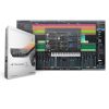
PreSonus have never been a company for low–key announcements, and true to form, Studio One 3 comes with the tag line “The Next Standard in Songwriting and Production”. With the huge range of software music-production tools available, it’s hard to know what the current standard is, but it’s good to know that we’re all going to be using Studio One “next”!
Amongst the key new features in version 3 are an Arranger track for song creation and rearrangement, a Scratchpad where you can try out new arrangement ideas, and a touch–friendly interface that takes advantage of multi–touch screens. PreSonus have revitalised the included plug–ins and instruments, and created new ways of combining them into super ‘multi–instruments’. They’ve also been listening to their user community, and have introduced the long–awaited automation curves and a bit of welcome MIDI processing. Do be aware, though, that the majority of the new features are available only in the Professional edition, which is what we’re reviewing here. Studio One Prime and Artist users have to make do with a refreshed interface and a couple of other bits and bobs unless they want to make use of the integrated shop to add more features or content. But have PreSonus ticked enough boxes to tempt users of other DAWs into their slick recording environment?
Activation Stations
At 90MB, the Studio One installer is surprisingly small. However, behind that there’s over 30GB of content which can only be installed by download, even if you buy a boxed copy! I always thought that the benefit of the boxed copy was that you got the entire product in the box, but sadly, all you get is a download code. For an extra £20, you can order a version with a USB thumb drive containing all the content, but if you don’t fancy that, then Studio One’s content is going to clog up your Internet connection for some time. I miss optical data discs!
There’s no subscription–style payment option, as has become the fashion lately, so you have to come up with the full amount at the time of purchase. There’s also no copy–protection dongle, which will be a relief to many, and PreSonus allow you a generous five activations on a single licence, so you can have it installed on your desktop at work, at home and on your laptop without worrying about losing or breaking a little USB key.
Healthy Economy
The single–window approach of previous versions is still evident in Studio One 3, but the re–skinning is sumptuously modern and flat, and makes version 2 appear oddly shabby and strange in comparison. The layout mirrors Sonar’s Skylight interface with the arrange window in the middle, the browser on the right and the mixer/console/editor at the bottom. Unlike Cakewalk, however, PreSonus have implemented this layout without it feeling crowded or complex. Scalability and support for high–DPI screens means it can look just as good on a large high–definition desktop screen as it can on a laptop or tablet.
The colour palette follows PreSonus’s love of muted blue, silver and deep greys, almost to the point of being a bit dull, but you have a lot of control over the hue and luminance of the background and arrangement windows to spice it up a bit. Compared with the colour cacophony of Pro Tools, the many windows of Cubase and the busy–ness of Sonar, Studio One exudes cleanliness and sobriety. If you installed a Calm button in every other DAW, this is what it would look like once pressed! It’s not that it lacks information or available functionality: it’s just that the noise has been beautifully designed away. Track information is a good example. Track headers contain the barest minimum of information — mute, solo, record enable, monitor and I/O assignments — and yet it’s no more or less than you need the majority of the time. Click the ‘I’ button at the top, and it calmly reveals the familiar inspector panel on the left, with all the information and parameters you could wish for — but you’re not encouraged to leave that open, and so the minimalist look is maintained. With a couple of well–placed hide/reveal buttons Studio One is able to keep everything accessible and yet fully under control.
The functionality of the arrange page has remained largely the same, with all the usual tools available to move, cut, splice, merge and manipulate chunks of audio and MIDI. One innovation, however, is that the right–click toolbar has been replaced with a comprehensive menu of editing operations, and instead, you can switch to an alternate tool mode, Logic–style, by holding the Ctrl key. For instance, you might have the arrow tool selected normally, with the split tool nominated as the alternative so it’s instantly available when you hold Ctrl. If you rely mainly on a couple of tools, it makes for very swift editing, although I imagine some Pro Tools users might be crying out for some sort of smart tool that offers up different functions depending on where you hover the mouse.
Automation has had a small tweak with the introduction of nodes between automation points to allow for the easy creation of curves.
Clicking and dragging these creates a simple single curve, while Alt–dragging generates a double curve. Automation is still continuous, there’s no form of automation clip or region system and it completely disappears when you hide the lanes, with not even a hint of it displayed on the track itself. You can use a separate automation track, which keeps it visible, but that seems to disconnect it from any edits and movements you make to regions on the source audio track, which is not always what you want
Music Computer & DJ Equipment
PRESONUS STUDIO ONE 3 PROFESSIONAL
Making Arrangements
Scratch That Itch
Better Browsing
VST Instruments
Fun With Formats
Note FX
Multi–tasking
Macro Bionic
Console Yourself
Return Of The Macros
Version 3 sees Studio One making a major leap forward, with a very attractive new interface and some brilliant songwriting and mixing tools.
Category: Music Computer & DJ Equipment
Brand: Presonus
People Who Viewed Items You Browsed Also Viewed
-
Music Computer & DJ Equipment
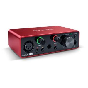
FOCUSRITE SCARLETT 2i2 3rd 2 In 2 Out AUDIO INTERFACE
Rp3.740.000Rp3.210.000 -
Music Computer & DJ Equipment
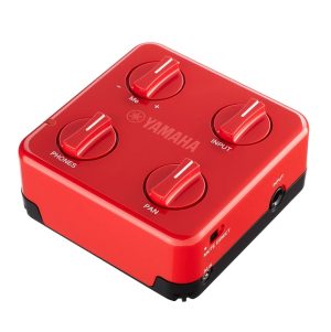
YAMAHA SC-01 SESSIONCAKE MIXING HEADPHONE AMPLIFIER
Rp1.280.000Rp1.024.000


